Creative CSS - Pebbles
Jay spends friday night (sad i know!) playing with CSS to find out how bendy it can be at generating low bandwidth web graphics that are beautiful and file-small.
Website filesize is a big deal for us at Aptivate as we aim to create websites and applications that are accessible to all - especially those in low bandwidth areas where connectivity is bad. Often this translates as text heavy, boxy and old school boring.
Does that mean we have to be boring?
We're not so sure - at least our clients tell us that they want their websites to be nice looking AS WELL as low bandwidth. So we're challenging ourselves to find creative ways to make beautiful low bandwidth sites. There are two main avenues we are exploring at the moment. You can see how we are trying out new ideas in my image optimisation experiment
- Better image optimisation (compression tricks, display methods, device specific...)
- Drawing on the web (css, javascript, icon fonts...)
The Inspiration
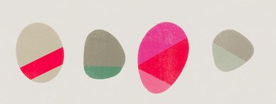
 These pebbles were inspired by the beautiful work Painted Pebbles by Garima Dhawan. Here is a jpg image of the section that i will be recreating. (43k)
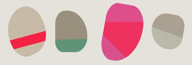
The idea was to recreate the irregular shapes and beautiful colourful stripes cutting across them with only css. I hoped to create a page of stones which could be scalable, sharp, beautifully colourful, textured and most importantly with a tiny file size (only 3k)
The CSS version
So here is an image of the css version. View the live css demo

Download the source files (zip 15k)
Here I've been using just css with some border radius, rotation and pseudo elements to render these lovely pebbles. I don't have time to go into it now but if you know css you can download the files and take a look.
If you want to find out how it's done - email me at jaya@aptivate.org and i'll create an extension to this blog post with instructions. For now I have to get back to creating low bandwidth mapping for Chevening
Thinking aloud
Thinking about the objectives of this exercise i can see a few things that are worth exploring further
- Use - What would this kind of web graphic ideally be used for?
- Accessibility - how should this content be marked up in HTML so that it's accessible?
- Compatibility - how many browsers can actually see this? what are the fall backs?
- CMS - you can't access the <head> element so how do content editors use css graphics?
- SVG - is it better than SVG?
- Interactive - how can the user interact with these elements?
