Interactive maps, a powerful way to get your message across
Maps! We have had the pleasure of working on lots of them. I caught up with Hamish who has been working on 3 map projects over the last year.
So, what map projects you have been working on?
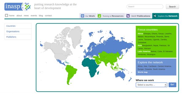
The first project I worked on was using Geochart, to create a map for INASP. This gives users a nice visual overview of where INASP are doing work and allows you to navigate through to the country you are interested in and see more detail.
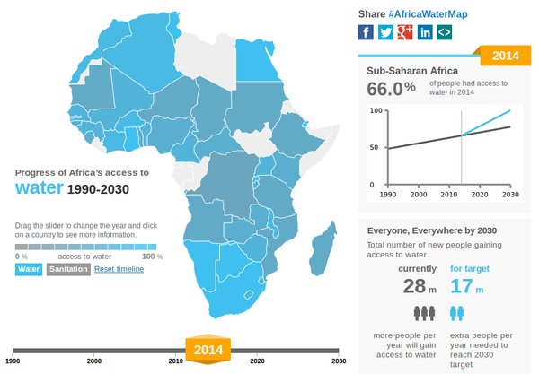
Then I worked on a Africa WASH Map, an infographic style map for Wateraid. This was purely a data visualisation that shows you how different countries are doing with their water and sanitation. You can also look back and see how countries have progressed over time.
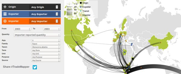
And then more recently, we have been creating Trademapper. Again a visualisation but one where you can upload your own data file. You can see it with some test data here. You can see where trade is going, highlight the routes to see more detail about the quantity and use the filters on the left to refine what is shown and analyse the data.
Cool! What different technologies did you use?
The INASP one uses Geochart, a google plugin, which works across many browsers. Geochart uses both SVG and VML. SVG is used for more recent browsers and VML works on older versions of Internet Explorer. It’s quite quick to implement, you can draw your map easily without doing lots of detailed code. At about about 1-200kb it’s not too heavy on bandwidth too.
Trademapper and Africa WASH map use d3, a Javascript library which does visualisations, also using SVG. That uses quite a lot of back end javascript and It’s relatively low level so you have to add quite a bit of code in to get it working. It’s very flexible and you can do some impressive stuff but it has to be built upon to do anything complex. It doesn’t work on Internet Explorer 8 or anything older but it is reasonably low bandwidth. The Africa WASH map was just under 100kb for everything (HTML, Javascript and CSS) so that’s quite nice. We used topojson to make the map data smaller.
The code is open source and available on Github for Africa WASH map and Trademapper.
Why are maps great tools for these projects?
Maps are very visual, it’s easy to give a quick overview of how things are looking. Also for navigating to a country it’s much nicer to click on a map than to scroll through a long list of countries names. Especially as countries might have multiple names. That was really useful for INASP.
On the African WASH map it’s great for giving an overview, you can quickly see which countries are doing well with the colours. For Trademapper, you can see the flavour going round the world and if there are general patterns, the transit countries etc. And then the filters are quite good for getting into the details. You can analyse the data and then when you have a particular story to tell, that you want to show that to people, you can use tradmapper to produce a map and use it on a report, flyer or something.
Why are Aptivate interested in map projects?
Well, the d3 ones particularly, are fun. Playing with the javascript and seeing things happening on the screen with different visualizations etc. They are nice things to show people as well as being useful and helping people.
And what about working with maps in the future?
We have learnt a lot with the these projects and we can start extracting stuff from them and making it easier to reuse. This would allow us to get going quicker for future map projects. I imagine we will be using it more in other tools; for example, we have been talking about using this kind of thing for our Monitoring and Evaluation projects.
Other people at Aptivate have also been doing some exciting things with Maps. For example, 3ie have used some maps with pins showing locations. I imagine we will be using that again in the future.
To find out more about our maps work or collaborate on a new project, get in touch with us at info@aptivate.org. You can also check out all of our open source projects on Github.


